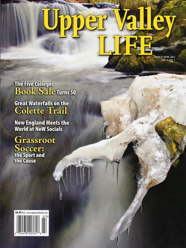
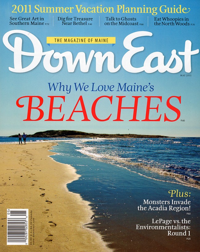
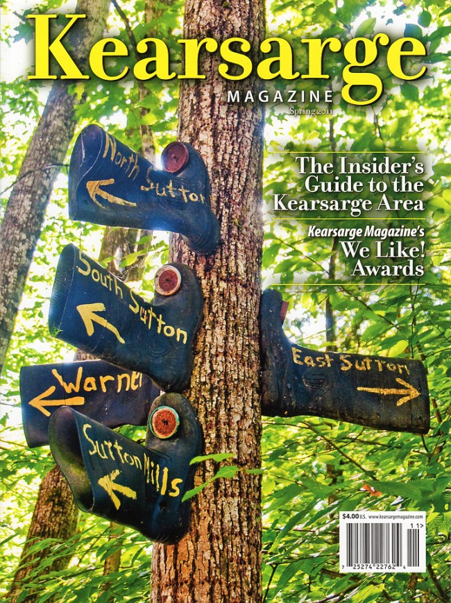
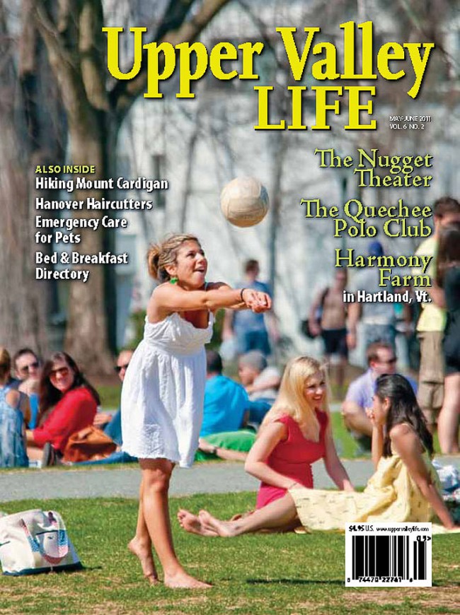
Kearsarge in New Hampshire, Upper Valley Life in NH and Vermont, and Down East in Maine are three great magazines. But I admit to being biased. All emphasize photography by “real” photographers rather than buying stock images supplied by huge corporations. All have editors and photo editors who are dedicated and responsive—the very kind of people I enjoy working with.
I have been very fortunate this spring. While I trekked in Nepal all three magazines used a photo I took on their covers. Having a photo selected for a cover is always a thrill but having three covers on the magazine stands simultaneously really makes the time I spend overworking photography worthwhile. To top it off, I learned yesterday that the newest (yet unpublished) issue of Upper Valley Life will also have a photo I took on the cover.
Here are two hints for photographers who would like to get an image on a magazine cover. First, shoot more verticals. Many more horizontal images than vertical ones get made—most cameras are easier to hold that way. But magazine covers need vertical images. As I tell my photo students, the best time to take a vertical photo is right after you take a horizontal one. Shooting both gives you compositional options and choices, and a better shot at making a cover image.
Second, when composing think about negative space in the image. Magazines need plain or non-busy areas, particularly near the image top, for their masthead and lists of featured articles. Cropping tightly and filling the frame are important skills for many photographers to learn, but they may be a bit counterproductive for cover images.
Here are the four spring 2011 covers.


